Smarter Nonprofit Donation Forms for Year-End Giving: 9 Simple Fixes
If you’re investing time in community outreach, email campaigns, and social media, but still seeing lackluster online donations—your form might be the problem.
Whether someone gives $10 or $10,000, their decision often comes down to a few critical seconds on your donation page. The good news? Small changes can make a big difference.
Here’s how to make your donation form work harder so your supporters don’t have to.
Essentials Every Donation Form Needs
These are the non-negotiables. If your form doesn’t check these boxes, start here.
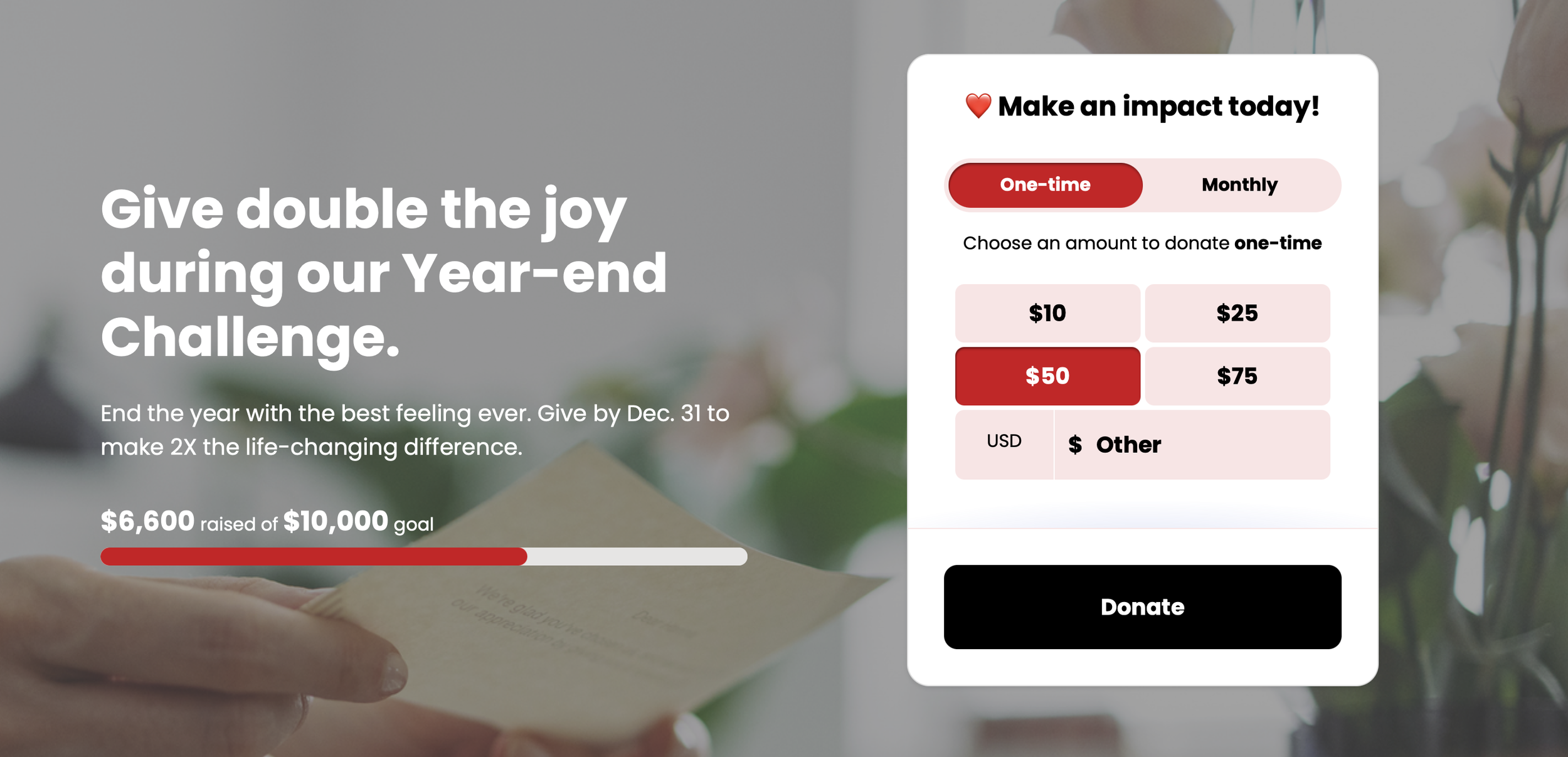
One Clear Call to Action. Your CTA button is where the decision happens. Don’t bury it with vague or generic copy. Use strong, action-forward language like “Donate Now” or “Give Today.” Skip “Submit.” It’s impersonal and easy to ignore.
Minimal Fields. Only ask for what you truly need. If a name, email, and payment info will do, leave it at that. You can always collect more later.
Mobile-Friendly Design. If your form doesn’t look good on a phone, you’re likely losing donations. Test how it renders on different screen sizes especially if you use background images or multi-step formats.
Smarter Giving Tools That Boost Results
Technology isn’t just for tech companies. When used thoughtfully, it can help you raise more money with less manual effort.
AI-Generated Giving Levels. Personalization converts. Use AI to predict what a donor is likely to give, then customize the suggested gift amounts based on their behavior or giving history. The closer your ask matches their intent, the more likely they are to follow through.
Embedded Forms. If your donation form opens in a new window or sends donors off-site, you’re introducing distractions. Embedded forms keep the experience clean and contained whether you’re linking from an email, social post, or landing page.
Digital Wallets. Speed matters. Offering options like Apple Pay, Google Pay, or PayPal allows donors to complete a gift with a single tap—especially on mobile. It’s fast, secure, and increasingly expected.
Add Human Touches That Build Trust
Giving is emotional. These details build credibility and connection so donors feel confident following through.
Show Impact Early. Don’t make people guess what their money will do. Tell them before they give. Specific examples like “$50 provides school supplies for one student” are far more compelling than general language about “supporting our mission.”
Testimonials or Quotes. A short quote from someone you’ve helped is more powerful than a paragraph of mission-speak. Show real voices, not polished pitches.
Secure and Trusted. Donors are savvy. Show them they can trust you. Include visual indicators like secure payment icons, SSL badges, and links to privacy policies. These small cues reduce hesitation and increase conversion.
Let’s Make Giving Easier
Online donation forms should feel as easy and trustworthy as giving to someone you know. When they don’t, you lose people.
Improving the donation experience works best when it’s paired with nonprofit stories that motivate people to give, not just better technology.
If you’d like a second set of eyes—or help building a smarter donation form—we’re here for that.
We design online donation forms that convert.
Let’s talk.