Best Nonprofit Online Annual Reports (And What Makes Them Work)
Dense PDFs and flipbooks have dominated nonprofit annual reports for years. Lead with a letter from the executive director, include a handful of impact stories, and close with several pages of charts that rarely get read beyond the finance committee.
That model still exists. But some organizations have moved well beyond it.
An online annual report carries real strategic weight. It shapes how donors understand progress, signals priorities to partners, and gives your community a window into how decisions translate into outcomes. It also gives you access to engagement data that simply isn't available with a static PDF.
When it's thoughtfully built, it becomes part of your brand.
Exploratorium, Carnegie Science, and Girls Who Code are each worth studying. Each approaches its report differently, but all build for digital with intention. Here’s what they get right.
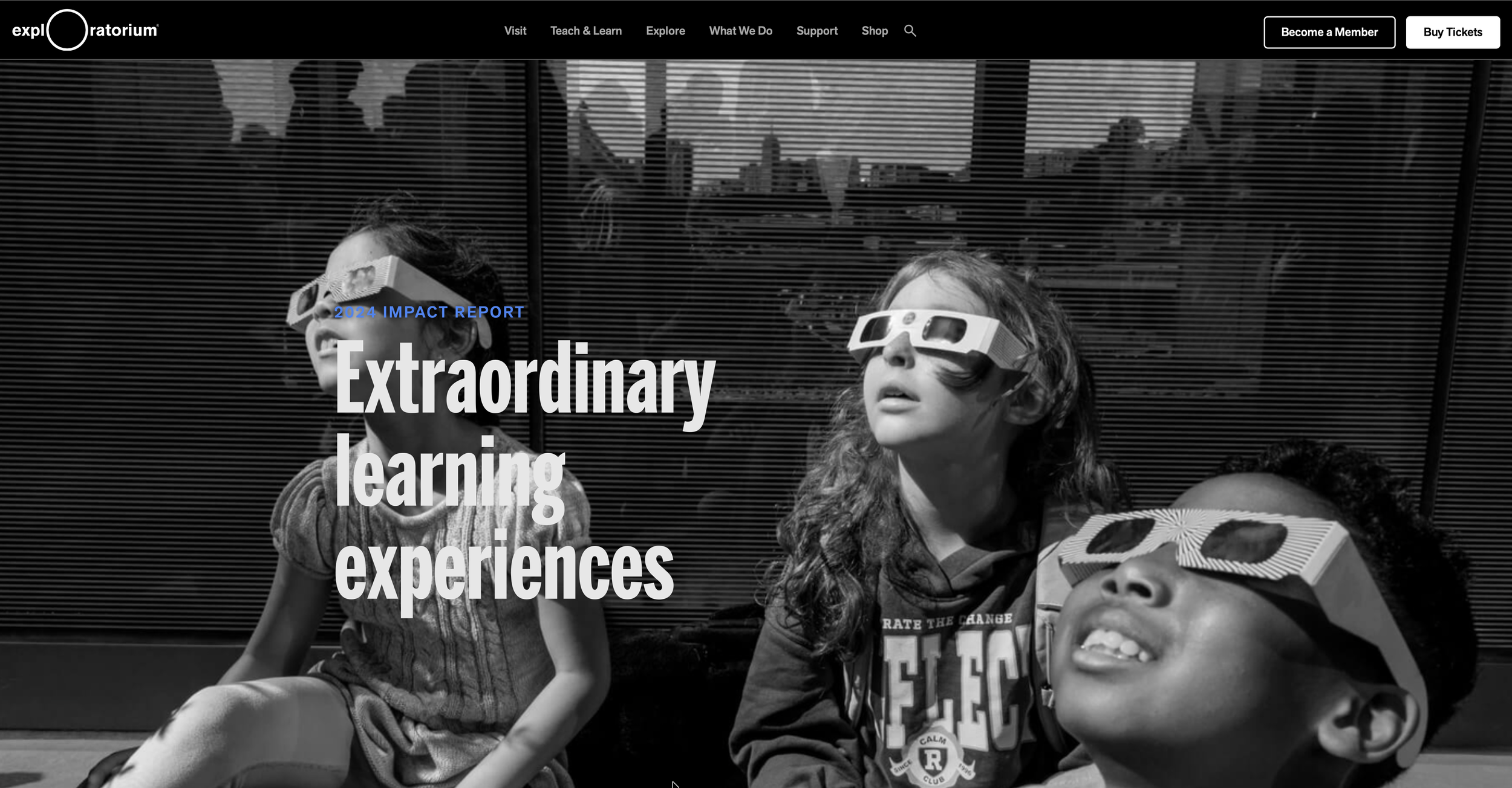
Exploratorium: Make Impact Easy to See
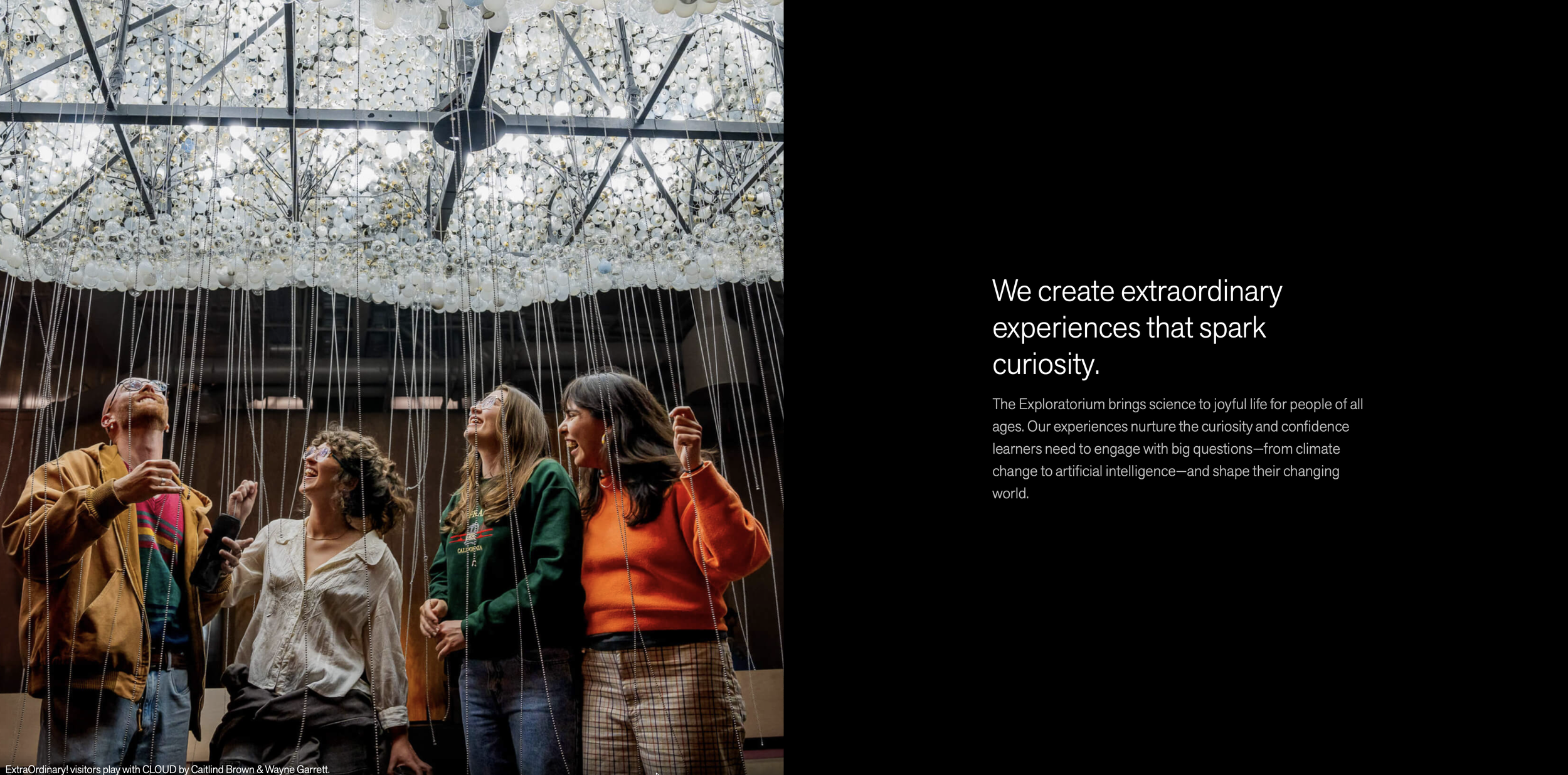
What makes Exploratorium's report work is that the photography isn't decorative. Full-bleed images capture movement, curiosity, hands-on engagement — the actual feeling of being inside the institution. You understand what the organization does before you encounter a single number. The metrics that follow land harder because of it.
Structure keeps everything moving without calling attention to itself. Sections are clean and scannable, financial information is easy to find, and the visual hierarchy does the navigational work so the reader doesn't have to think about it.
Most nonprofit reports feel like the design team and the communications team handed off to each other at the last minute. This one doesn't. Tone, pacing, and visuals all reflect the same identity. It feels like someone was in charge of the whole thing.
Best practices to borrow:
Use photography that reflects the actual experience of your mission, not just the outcomes
Let imagery carry the reader into the work before metrics explain it
Build visual hierarchy that guides the scroll without announcing itself
Connect participation data directly to people, not just program categories
Carnegie Science: Give the Story Structure
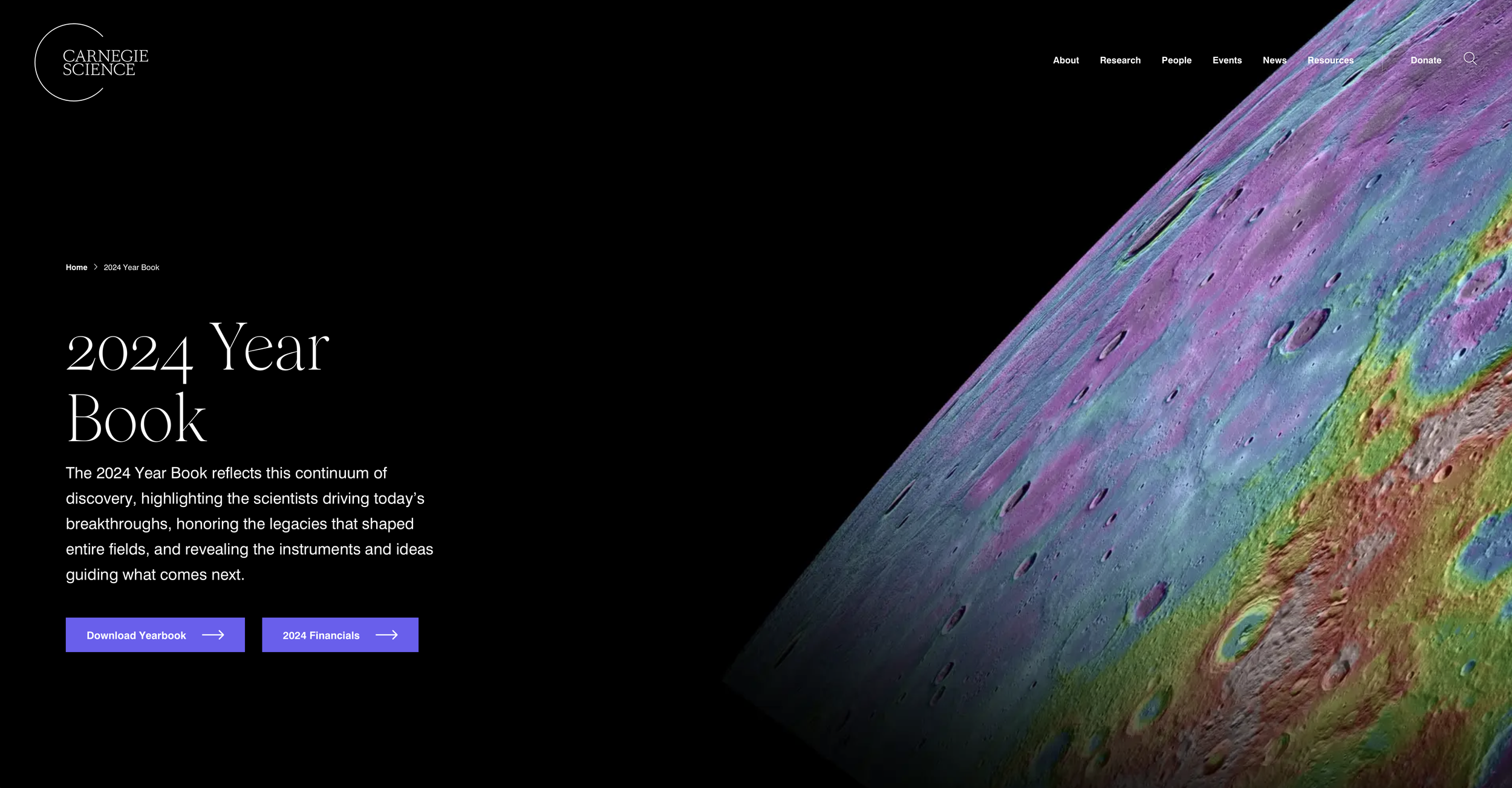
Carnegie Science treats its online report as an editorial project, and the difference shows.
Researchers are central. Discovery is the through line. The report narrows from leadership framing into specific stories of people and their work, and that pacing gives complex scientific content room to breathe. The tone assumes an engaged, curious reader and doesn't talk down to them.
The design is restrained on purpose. Clean layouts and minimal visual noise create space for complicated ideas to land. It's a harder thing to pull off than it looks — most organizations fill white space because silence makes them nervous. Carnegie Science resists that impulse, and the report is better for it.
Best practices to borrow:
Build a narrative arc that moves from orientation to depth
Center the people doing the work, not just the work itself
Use design restraint as a deliberate editorial choice
Write for an intelligent reader, not a general one
Girls Who Code: Let Data Lead
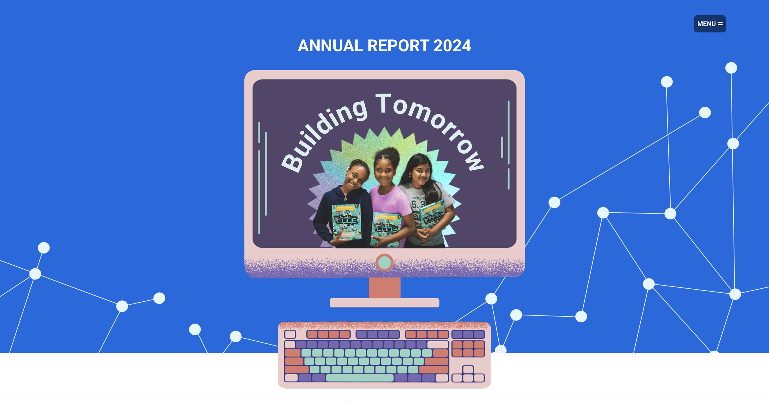
Girls Who Code leads with scale and doesn't apologize for it. Large metrics appear early: growth, participation, alumni reach. The numbers are big enough to be the story, and the report treats them that way.
What keeps it from feeling like a data dump is context. The metrics connect to broader conversations about technology, access, and who gets to participate in it. You understand not just what happened but why it matters.
The design reinforces that momentum. Bold figures, strong typography, purposeful use of color. Current outcomes connect to future ambition, so you finish the report understanding where the organization is heading, not just where it's been.
Best practices to borrow:
Lead with your strongest impact numbers if the scale is genuinely impressive
Frame data within the larger conversation your mission is part of
Use design to create forward momentum, not just organize information
Make your future direction as visible as your past results
What These Three Online Annual Reports Have in Common
Each of these reports is selective. Not every program update made the cut. What's included serves a larger story, and you can feel the editorial judgment behind that. They're also all built for how people actually read on screens — sections that reward scrolling, hierarchy that guides the eye, content that doesn't demand to be read start to finish.
The bigger thing they share is that someone made real decisions. What to include, what to cut, what to lead with, how to end. That kind of intentionality is what separates a report that builds trust from one that just fulfills an obligation.
Building Your Next Online Annual Report
Before you start, get clear on three things. What is the core story you're telling about your role in the world? What evidence best supports it? How do you want the reader to feel when they're done?
Online reports aren't digitized PDFs. They're structured environments that require editorial judgment from the first page to the last. When that judgment is present, the report does real work — reinforcing trust, extending your brand, and giving your community something worth returning to.
A Note on Web vs. PDF
Nonprofits often ask whether to invest in an online report when donors still request a PDF. The honest answer is that format should follow your primary audience. Institutional funders may expect a downloadable document. Community engagement, search visibility, and long-term content value live on the web.
What matters most is the standard you hold yourself to. A weak PDF is still weak. A rushed website is still rushed.
For a deeper look at how to approach this, read Nonprofit Annual Report Best Practices: Think Like a Creative Director.